In a game we are building, we needed a custom widget that looks like the classic volume control knob.

We went ahead and built a custom view for this. The view itself is available as a library. Below is a brief description of the creation process.
Custom or Compound view?
Android provides a wide array of widgets that can be combined to create most UI elements. It is always a good idea to reuse existing widgets in a Compound View if possible. For the picker knob, existing widgets were not ideal. Custom view it was then.
Strategy
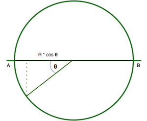
Mathematics To get realistic physics and behavior, we visualized a strip of equidistant markers wound on a circular dial. Based on the current rotation, the view identifies the markers on the front half of the dial, projects them on a 1-d space (the line AB in the diagram below) and draws them on the screen.
The marker at position A at rotation 0 would represent the minimum value for the widget (0 by default). Each marker would represent an increment of 1. Based on the maximum value and gap between the markers, we can calculate the total markers and the maximum allowed rotation.
Physics When the user touches the screen, all existing motion should stop and the widget should follow the user’s finger. On the fling gesture, the widget will get an initial angular velocity with a fixed deceleration.
Implementation
Step 1 - Draw the markers
To get things started, we will first get the markers on the screen.
public class PickerKnob extends View {
  ...
  @Override
  protected void onMeasure(int widthMeasureSpec, int heightMeasureSpec) {
    // Fixed width and height
    setMeasuredDimension(800, 200);
  }

  @Override
  protected void onDraw(Canvas canvas) {
    int startPosition = 0;
    float oldX = -1;
    while(true) {
      float theta = (startPosition * mDashGap)/mRadius;

      // Once we reach the last marker on the front, x will start to decrease.
      // We can stop drawing at this point.
      float x = (float) (mRadius * (1 - Math.cos(theta)));
      if(x < oldX) {
        break;
      }
      oldX = x;

      // Draw alternate big and small lines
      canvas.drawLine(x, ((startPosition % (2) == 0) ? 0 : mDashHeight / 2), x, mViewHeight, mPaint);
      startPosition++;
    }
  }
}
With this, we get a nice looking dial to work with.

Step 2 - User specified width and height
Update onMeasure to respect user specified width and height.
@Override
protected void onMeasure(int widthMeasureSpec, int heightMeasureSpec) {
    int widthMode = MeasureSpec.getMode(widthMeasureSpec);
    int widthSize = MeasureSpec.getSize(widthMeasureSpec);
    int heightMode = MeasureSpec.getMode(heightMeasureSpec);
    int heightSize = MeasureSpec.getSize(heightMeasureSpec);

    int width, height;

    //Measure Width
    if (widthMode == MeasureSpec.EXACTLY) {
        //Must be this size
        width = widthSize;
    } else if (widthMode == MeasureSpec.AT_MOST) {
        //Can't be bigger than...
        width = Math.min(mViewWidth, widthSize);
    } else {
        //Be whatever you want
        width = mViewWidth;
    }

    //Measure Height
    if (heightMode == MeasureSpec.EXACTLY) {
        //Must be this size
        height = heightSize;
    } else if (heightMode == MeasureSpec.AT_MOST) {
        //Can't be bigger than...
        height = Math.min(mViewHeight, heightSize);
    } else {
        //Be whatever you want
        height = mViewHeight;
    }

    setMeasuredDimension(width, height);
}
Step 3 - Add rotation
Next, we want to add rotation to it. We’ll have to update the onDraw method for this.
@Override
protected void onDraw(Canvas canvas) {
    // Get the first visible dash
    int startPosition = (int)Math.ceil((mRadius * mRotation)/ mDashGap);
    startPosition = Math.max(0, startPosition);
    float oldX = -1;
    while(true) {
        float theta = (startPosition * mDashGap)/mRadius;
        theta = theta - mRotation;

        // Once we reach the last marker on the front, x will start to decrease.
        // We can stop drawing at this point.
        float x = (float) (mRadius * (1 - Math.cos(theta)));
        if(x < oldX) {
            break;
        }
        oldX = x;

        // Draw alternate big and small lines
        canvas.drawLine(x, ((startPosition % (2) == 0) ? 0 : mDashHeight / 2), x, mViewHeight, mPaint);
        startPosition++;
    }
}
Step 4 - Add touch handling
To handle touch events, we’ll override the onTouchEvent method.
@Override
public boolean onTouchEvent(@NonNull MotionEvent event) {
    switch (event.getAction()) {
        case MotionEvent.ACTION_DOWN:
            startTouch(event);
            return true;

        case MotionEvent.ACTION_MOVE:
            if(startScrollIfNeeded(event)){
                processTouch(event);
                return true;
            } else {
                return false;
            }

        case MotionEvent.ACTION_UP:
            processTouch(event);
            return true;

        default:
            endTouch(0);
            return false;
    }
}
In startTouch, we will remove any previous running motions. In startScrollIfNeeded, we will check when the user has moved her finger by more than a threshold value, and then start processing the touch events. In processTouch, we will update the rotation as the user moves her finger. As soon as the user lifts the finger, we will calculate the velocity of the fling and give that velocity to our view. The complete code is available here
Step 5 - Make it customizable
Now that we have a nice looking dial that responds to user touches, it is time to make it customizable. We declare a styleable and specify all the customization options.
<?xml version="1.0" encoding="utf-8"?>
<resources>
    <declare-styleable name="PickerKnob">
        <attr name="picker_min_value" format="integer"/>
        <attr name="picker_max_value" format="integer"/>
        <attr name="picker_dash_gap" format="dimension"/>
        <attr name="picker_text_size" format="dimension"/>
        <attr name="picker_text_padding" format="dimension"/>
        <attr name="picker_text_color" format="integer"/>
        <attr name="picker_dash_count" format="integer"/>
        <attr name="picker_friction" format="float"/>
    </declare-styleable>
</resources>
Now we just need to read these values in our view, and we are done.
Using
Android Picker Knob is available as a library project. To include it in your application, update your build.gradle file as
- To the repositories, add
maven { url "https://jitpack.io" } - and to the dependencies, add
compile 'com.github.moldedbits:android-picker-knob:0.2'
Happy coding!
The moldedbits Team